HINT: Use Trendline on your scatter chart
Step 01
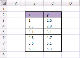
Type your data on Excel cells
Step 02
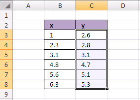
Select all y data value (not x)
Step 03
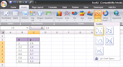
Click Insert menu, then select Scatter chart type. Select one type.
Step 04
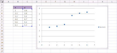
Now you get your scatter chart
Step 05
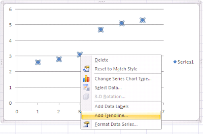
Click on data plot (exactly on one of the blue dots) so they selected. Then right click the selected to show the menu. Click on the Add Trendline...
Step 06
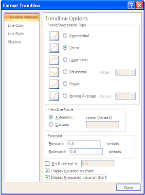
Choose Linear on the Trend/Regression Type.
Choose Display Equation on Chart.
Choose Display R-squared value on chart.
Step 07
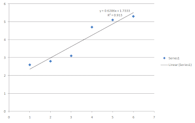
Finally you got Linear Regression

No comments:
Post a Comment